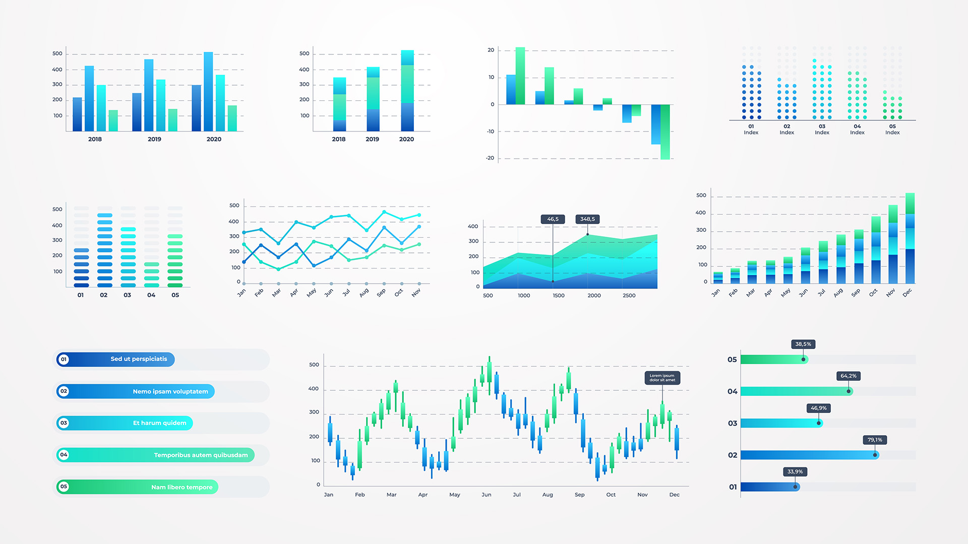
I looked around the crowded ballroom and saw people starting to nod off. Sure, the open bar probably played a role and so did the open buffet dinner. But the real culprit stood behind a tall, wooden podium droning on about EBITA, GAAP, KPI’s, and ROIs.
While they are all important benchmarks and numbers, they don’t do anyone much good if the presenter keeps bombarding the audience with them and puts the audience to sleep. There isn’t enough wine and chicken parmesan to get you through that.
In today’s business climate, data is currency—but it only pays dividends if your audience listens, understands and remembers it.
Whether you’re briefing stakeholders, pitching to investors, or rallying your team, your job is to lead—not just with facts, but with clarity, insight, and influence. Here’s how to turn dry data into dialogue that moves people.
Step 1: Start with the Story, Not the Stat
Great presentations follow the same structure as great stories:
- Set up: Put the audience into the situation
- Struggle: Identify the problem and why it matters
- Solution: What does the data reveal that changes the way we think?
Example: Instead of starting with “Q2 revenue was $4.2 million,” begin with something like this: Imagine sitting with me, looking out my office window at the traffic backed up on I-95 and realizing the same problem that causes gridlock at rush hour was also blocking our sales funnel and seriously impacting our results. Now you have the audience’s attention because they’re wondering, “What’s the problem?”
Step 2: Use the Rule of One: One Message Per Slide
Each slide should support one idea. Not three. Not five. Just one. Your slides are not Manhattan real estate. Putting more and more information on each slide means less and less impact on your audience.
Why It Works: You might spend a few hours preparing your slides. The audience gets one pass at them. When an audience feels overwhelmed, they tap out and put their attention somewhere else—email, Instagram, or tomorrow’s to-do list. Always make sure your slides are heavy in white space, not data.
Step 3: Choose Clarity Over Complexity
Visuals should simplify, not show off. If it takes more than five seconds to understand a chart, it’s not helping.
Try This Instead:
- Replace dense bar charts with clean, labeled line graphs.
- Use arrows to guide the audience’s attention to exactly where you want them to look on each slide.
- Limit colors to your brand palette or meaningful categories.
Step 4: Translate Stats into Human Impact: Identify what the stats mean to people
Stats are actually the supporting evidence, not the headline. Every stat must earn its place by answering a simple question: Why does this matter?
Use analogies, comparisons, or storytelling to make data relatable. Instead of saying “site traffic grew 23%,” say “That’s the equivalent of filling a football stadium every day.”
The more you turn numbers into mental pictures, the easier the numbers are to remember. Let me prove it to you. There are 43,560 square feet in an acre.
You likely won’t remember that number by the time you finish the next paragraph.
Now, think of it this way. An acre is basically an NFL field without the endzones. Bam. You’ll never forget how big an acre is.
Numbers are important. But having your audience remember the numbers is even more important. Turn numbers into pictures or relate the numbers to things people can see and that creates impact.
Step 5: Speak Like a Leader, Not a Data Analyst
Data-laden phrases like “statistically significant variance” or “normalized benchmarks” might work in a report, but they don’t work in a presentation.
Instead, say something like this:
- “We saw a meaningful shift in customer behavior.”
- “This metric tells us we’re gaining ground in our key markets.”
Speak with authority, not ambiguity. Your audience isn’t craving more numbers—they want to know what you think and what they should do next.
Final Thoughts: Lead With Insight, Not Just Information
Data without interpretation is just noise. Metrics only matter when they move people. As a business leader, your edge comes not from being the smartest person in the room, but the clearest.
The next time you face a room full of stakeholders, don’t just present data. Tell the story behind it. Invite your audience into the dialogue—and lead them to action.
I hope that helps your next presentation.

Looking for more suggestions on how to prepare, practice, and perform your presentations at a level you never thought possible? Check out our Presentation Transformation online course!


